


Welcome to our free newsletter, Acquired Taste. Paid subscribers receive a weekly newsletter containing an in-depth lesson to cultivating an exquisite wardrobe while saving time, money and answering the age old question of “what should I wear today”.
There was a time when our world exploded with color. All those white marble statues of antiquity wore vibrant colors. Renaissance masters painted in rich hues of vermilion and azurite. When the 1950s suburban dream arrived in turquoise kitchens and pink bathrooms. When the psychedelic 60s painted our consciousness in kaleidoscopic swirls, the 80s shouted in neon and the 90s popped with primary colors.
But look around you now.
Our cars? Silver, white, black, and grey make up over 80% of vehicles on the road today, compared to just 50% in the 1990s. Our homes? Beige, greige, white, and charcoal. Our wardrobes? A sea of neutrals, punctuated only occasionally by some corporate-approved shade of blue. Even our technology, once available in translucent candy colors, now comes in various shades of nothing.
We didn't arrive here by accident.
Perhaps it was the recession of 2008 that ushered in an era of "safe choices." Real estate agents advised neutral palettes to "maximize resale value." Minimalist aesthetics equated sophistication with absence. Instagram filters drained the saturation from our memories. Corporate America embraced the sterile aesthetic of the tech world—sleek, unobtrusive, anonymous.
And somewhere along the way, we started to believe that seriousness required somber tones. That professionalism meant invisibility. That taste required restraint.
Let me say this as clearly as I can: That’s bullshit.
Color is not frivolous. Color is not childish. Color is not unprofessional.
Color is life itself.
The question isn't why some people choose neutrals. The question is why so many of us have abandoned color altogether. When did bold become synonymous with bad? When did we decide that blending in was better than standing out?
Perhaps it's no coincidence that our drift toward monochrome parallels other sobering trends. Our increasing anxiety. Our growing isolation. Our addiction to screens that deliver ever more troubling news in high-definition greyscale.
So here's my proposition—a modest rebellion that starts with your closet door.
Wear color like it's an act of resistance. Because it is.
Wear yellow because it defies cynicism. Wear red because it refuses to be ignored. Wear green because it celebrates growth in a world obsessed with scarcity. Wear purple because it demands to be extraordinary in ordinary times.
I'm not talking about accessorizing with a "pop of color" while keeping everything else safely neutral. I'm talking about commitment. About wrapping yourself in brilliant hues that announce your presence before you've said a word.
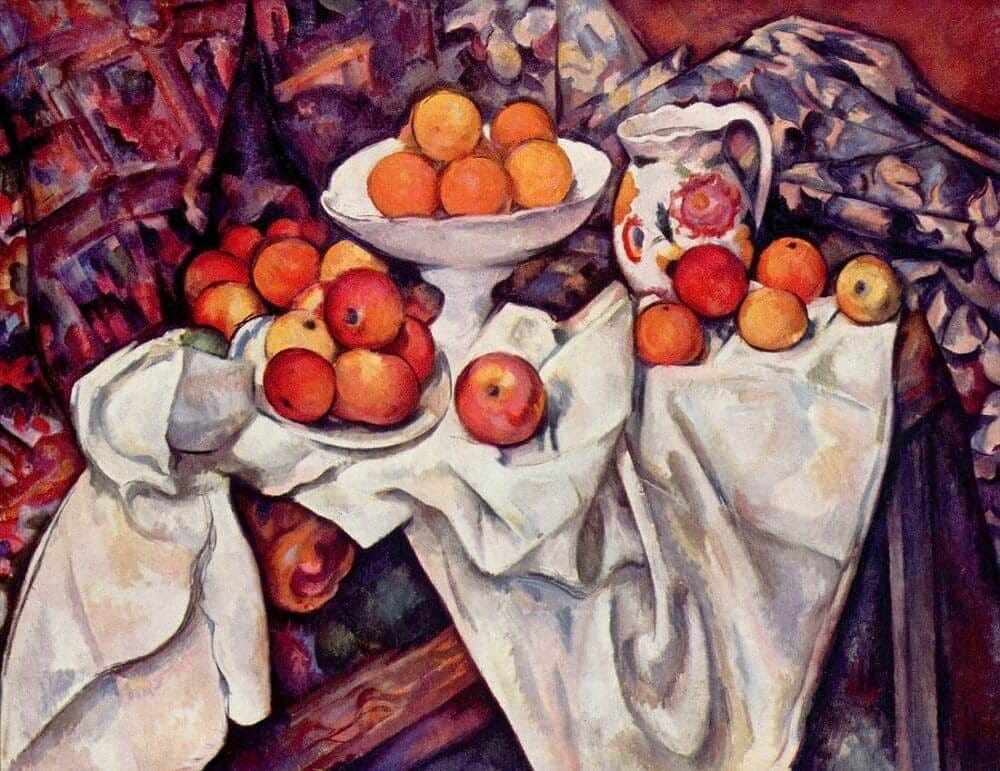
"We live in a rainbow of chaos," as Paul Cézanne observed. So why have we tried so desperately to impose order through absence?
Spring is here. The world outside your window is about to erupt in riotous color whether you participate or not. The cherry blossoms don't worry about appearing too feminine. The tulips don't tone it down to avoid offending sensibilities. The blue sky doesn't question whether it's making a scene.
Nature knows what we've forgotten: color isn't just decoration—it's communication. It's identity. It's joy declared in visual form.
So tomorrow morning, when you reach into your closet and your hand automatically moves toward something black, something beige, something safely invisible—stop. Make a different choice. Reach for something that makes your heart beat a little faster. Something that makes you feel a little braver. Something that says, "I am here, and I refuse to disappear into the background."
I'm not suggesting you need to wear amaranth head to toe. I wear a lot of navy and shades of blue like everyone else. But we need to embrace color as accents, as base colors. Personally, I embrace rich greens—from my suit to my briefcase, water bottle, wallet, and even AirPods. Last summer in an airport, a woman nearby commented that my favorite color must be green. It is. And that small consistency creates both joy and identity.
Wear color like armor against despair. Wear color like medicine for melancholy. Wear color like a flag planted in the territory of hope.
Because the news may be dark, but you don't have to be. Because the world may feel broken, but your spirit doesn't have to match. Because every bright sweater and brilliant scarf and audacious pair of shoes is a small but meaningful declaration: I still believe in beauty. I still believe in joy. I still believe we deserve a world vibrant with possibility.
This isn't frivolous. This is fundamental.
Color is life refusing to apologize for itself.
And in times like these, that might be exactly the revolution we need.
If you enjoyed what you read today, please click the heart so more people like you can see our work.
If you find value in this content, click to subscribe below.
Free subscribers will receive a biweekly Sunday edition of our Acquired Taste newsletter including a quick tip to cultivating a beautiful wardrobe, as well as previews of our weekly paid newsletter.
Paid subscribers will get weekly in-depth emails featuring tips and tutorials that will:
Save you money in the long run while vastly improving your wardrobe.
Save you time by making buying clothing and dressing effortless and enjoyable.
Eliminate the headaches of a closet full of clothes and nothing to wear.
The cost is $8 a month (or for a savings at $80 a year) which is the equivalent of one overpriced, over-sugared caffeinated beverage or a cocktail at a mid-range eatery - quite a value for 52 installments of looking great, buying less and saving time. That comes to only $1.84 an installment!
Ohhhh… this sings like a manifesto and strikes like a lightning bolt in a grayscale storm. Yes, yes, and yes again!
The chromatic collapse of the modern world is no coincidence, it mirrors a cultural contraction, a retreat from sensation, risk, and individuality. We have mistaken muted tones for maturity, and caution for class. But beige is not virtue. Greige is not grace. And I’ll be damned if I let taupe dictate the tone of my days.
As someone who lives in Paris — a city unjustly accused of wearing only black — I take great pleasure in violating that stereotype. I own a red wool coat so bright it makes tourists blink. I have a collection of jewel-toned dresses that have walked through Montmartre and startled monochrome cafés into colour. My favourite is a deep emerald one passed down from my grandmother: when I wear it, I don’t simply walk, I declare.
And here’s the truth: people look. They respond. Strangers comment, children smile, older women nod in quiet approval like you have upheld some forgotten code. Wearing colour isn’t vanity. It is visual generosity. It is giving the eye a place to rest besides asphalt and advertising.
To your idea of colour as resistance, I would add this: colour is also memory. Our lives don’t play out in black and white, and yet we archive ourselves that way. I remember my happiest summers by the saffron of the sunset, the cobalt of Mediterranean tiles, the shocking pinks of my mother’s garden. We don’t recall joy in Pantone 427 C.
We need to bring back the audacity of hue. Not as accent, not as apology… but as presence! As declaration! As an answer to a world that wants us invisible, palatable, algorithmically safe. Wearing colour is not childish, as many women think today. It’s the opposite: it’s what adulthood should look like when it refuses to forget wonder.
So yes, wear red like a siren of selfhood. Wear yellow like you mean it. Let your clothes whisper courage or scream insurgence. But most of all, let them speak.
Because silence has a shade too. And we’ve been wearing it long enough….
Well said! I love bold colors.